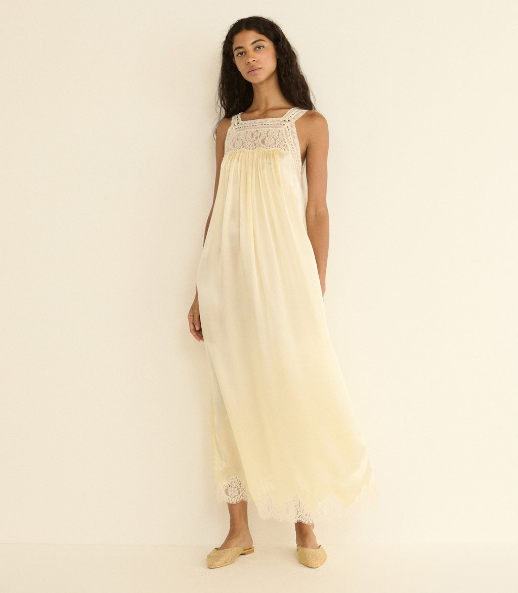
There is a particular kind of quiet that arrives with a color like butter yellow. It is not the silence of absence, but the calm of presence. In a cultural moment that often equates visibility with volume, the emerging focus on this soft, sun-warmed hue feels less like a trend and more like a reminder. It asks us to slow down, to consider how light moves across a room, and to find confidence in something that glows rather than shouts. This is the energy we are drawn to: a shade that suggests warmth, but never urgency.
For our readers, this is not a directive to overhaul a wardrobe so much as an invitation to reassess what radiance means. We see the connection between this sensibility and the conversations happening around The Quiet Pursuit of Natural-Fabric Dressing for Light Summer. Both speak to a desire for ease that is considered, not careless. When you choose a piece in butter yellow, you are not just selecting a color; you are opting into a mood of deliberate softness. It pairs beautifully with the mindful approach to consumption found in The Quiet Power of Sustainable Style: A Survey on Mindful Fashion Choices, where the choice of what we wear becomes an extension of how we intend to move through the world. This is not about chasing a fleeting moment, but about curating a lasting atmosphere.
Our honest take is that this shade operates as a form of emotional armor for the self-assured. It does not demand attention; it commands it through subtlety. For the woman who wears it, the color is a private statement of optimism. It is the sartorial equivalent of a deep breath before a conversation. The practical takeaway here is to lean into texture and fabric when exploring this tone. Because the color is soft, the silhouette and material must carry substance. A structured jacket in this hue offers a different kind of confidence than a flowing, sheer blouse. The former is authoritative, the latter is romantic; both are valid, but each tells a different story about your intention for the day.
What we would tell a reader who asks us about this is simple: do not be afraid of its perceived fragility. Butter yellow is not a compromise; it is a choice to find strength in gentleness. It is a color that looks as good in a tailored trouser as it does in a relaxed knit, and it pairs unexpectedly well with the grounded, neutral palettes we love for fall. Watch for how it appears in accessories first, if a full look feels like too much commitment. A bag, a pair of loafers, or a silk scarf in this tone can elevate the simplest of outfits, bringing a sense of light to an otherwise understated ensemble. It is a reminder that true luxury is often found in these small, considered moments of joy. The detail to watch is how you pair it: let the color be the hero, and let your confidence do the rest.