I’m Not Emotionally Prepared for Summer to End—3 Viral Color Combinations I’m Holding On To
Our take
The cyclical melancholy of summer’s end is a feeling universally understood, and Marie Claire’s recent “Put Together” series offering three viral color combinations to cling to speaks directly to that sentiment. It’s a clever, accessible approach to a trend that often feels dictated from above – the runway collections, the influencer feeds – but here, it’s presented as a comforting ritual, a way to extend the feeling of warmth and vibrancy as the days grow shorter. The piece’s focus on color as a mood-lifter, rather than solely as a trend to be chased, resonates with a broader shift in fashion consumption. We’re seeing a move away from fleeting micro-trends and toward cultivating a more personal, enduring style, one rooted in feeling good and expressing individuality. This aligns perfectly with our ethos of quiet luxury and intentionality – it’s about choosing colors that evoke a specific emotion, a personal narrative, rather than blindly following the dictates of the season. It echoes the sentiment of [Easy, Effortless and Elegant—5 Chic Outfits That Will Be My Go-Tos This Autumn], where the emphasis is on building a versatile, considered wardrobe.
The beauty of this approach also lies in its grounding. While inspired by runway trends, the combinations presented are surprisingly wearable and adaptable. This avoids the common pitfall of aspirational fashion content that feels unattainable or overwhelming. It’s not about recreating an entire look; it’s about incorporating a color pairing into existing pieces, making it immediately accessible to a wider audience. The Marie Claire piece smartly taps into the current cultural conversation around “that girl” aesthetics and the pressure to constantly curate a perfect online persona. Instead of promoting a relentless pursuit of perfection, it offers a simple, joyful way to inject personality and optimism into everyday dressing. This resonates with our audience’s desire for authenticity and self-expression, a desire that’s becoming increasingly important in a world saturated with manufactured imagery. The ongoing exploration of style tribes, as highlighted in [These 6 Style Tribes Will Be the Dominating Trends For Autumn], reveals a growing desire for belonging and identification, but also a simultaneous rejection of rigid categorization. These color combinations offer a subtle way to express individual style without feeling confined by trends.
Furthermore, the strategic placement of this piece within Marie Claire’s content ecosystem is noteworthy. Linking to articles like [Sorry, Flip-Flops—Elegant Over-50s Are Preferring to Wear This French Shoe Trend With Denim] demonstrates a cohesive editorial strategy, highlighting the broader theme of elevated, understated style. It’s not just about colors; it’s about a philosophy of dressing that prioritizes quality, timelessness, and personal expression. The recurring emphasis on effortless elegance across these articles reinforces the idea that style shouldn’t feel like a performance. It should be a natural extension of one's personality and a source of quiet confidence. This echoes the core message of our brand: that true style is not about shouting for attention, but about radiating a quiet, assured presence.
Ultimately, this trend – the use of color as a tool for emotional resonance and self-expression – signals a broader shift in the fashion landscape. We’re moving beyond the superficiality of trend-driven consumption and toward a more meaningful engagement with clothing. It's a fascinating evolution, and one that aligns perfectly with our brand’s values of intentionality and self-awareness. A question worth watching is whether this focus on emotional connection will extend beyond color and into other areas of fashion, such as material sourcing, garment construction, and the overall brand narrative. Will brands increasingly prioritize creating pieces that not only look good but also *feel* good—both to wear and to support?
Welcome to Put Together, Marie Claire's new fashion video series.
Every other week on Instagram and TikTok, Fashion Editor Lauren Tappan breaks down the season’s biggest trends—from celebrity style moments to runway standouts—and shows how to make them feel wearable in real life.
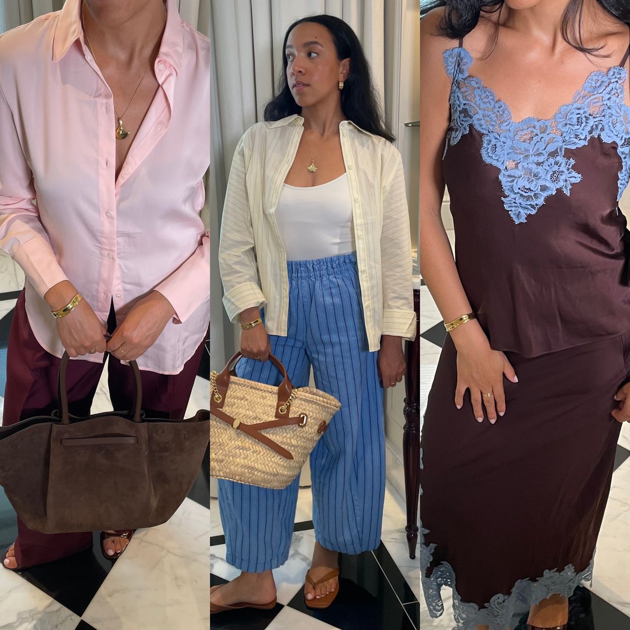
While autumn is right around the corner, I’m not ready to give up sunny poolside hangouts and weekend getaways by the shore. So, in the spirit of soaking up the last few weeks of summer, I’ve decided to incorporate the season’s most coveted color combinations into my wardrobe. Using the Spring 2026 runways as inspiration, I noticed that Tory Burch played into Y2K’s classic chocolate brown and baby blue mash-up, Chanel put a fresh twist on the viral bubblegum pink trend by adding merlot into the mix, and Chloé co-signed butter yellow and sky blue.
Ahead, I’m showing you how to make these runway-approved combos wearable beyond the catwalk. From polished nine-to-five uniforms to casual coastal looks, finish out the rest of summer in these vibrant outfits.
Chocolate Brown & Baby Blue
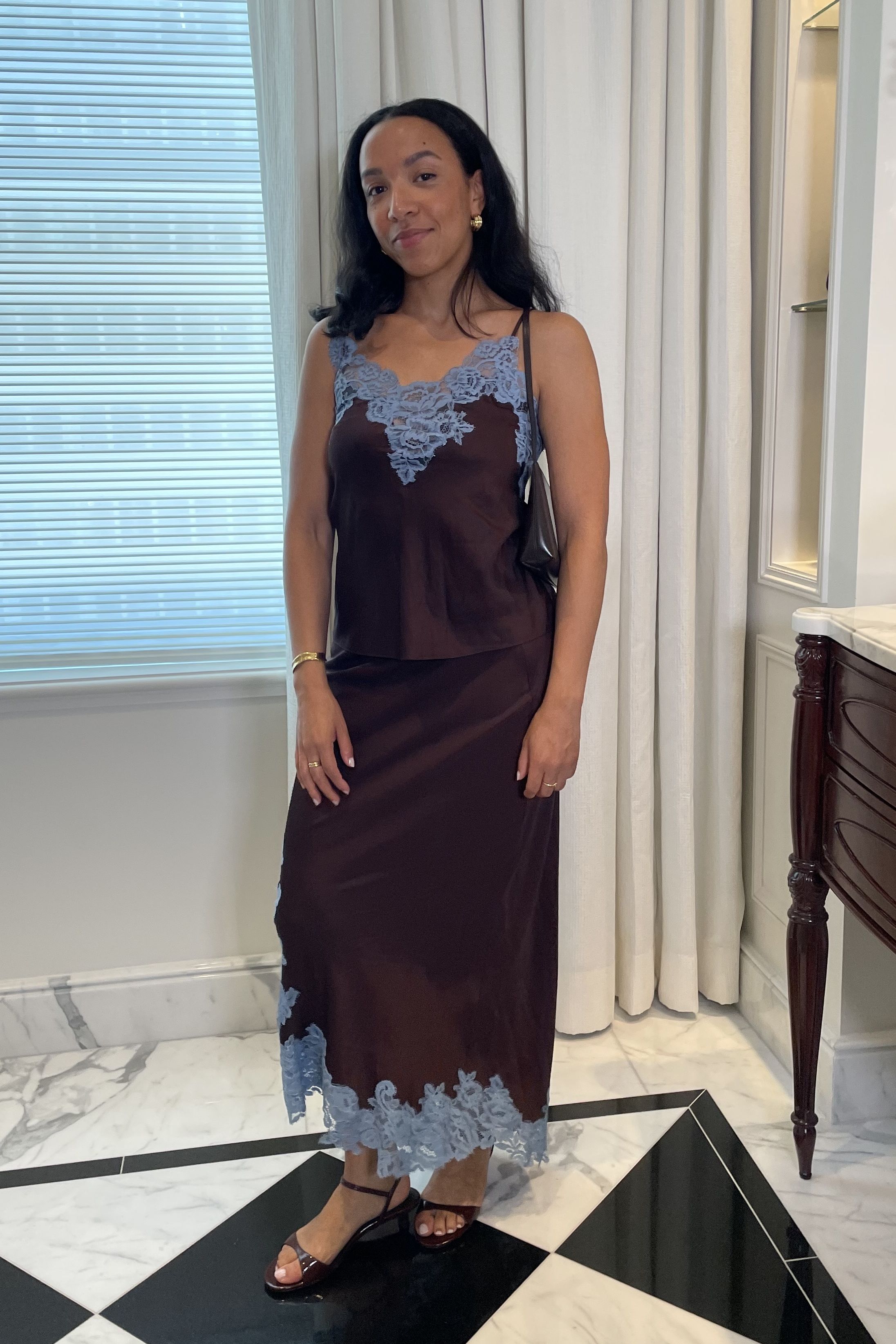
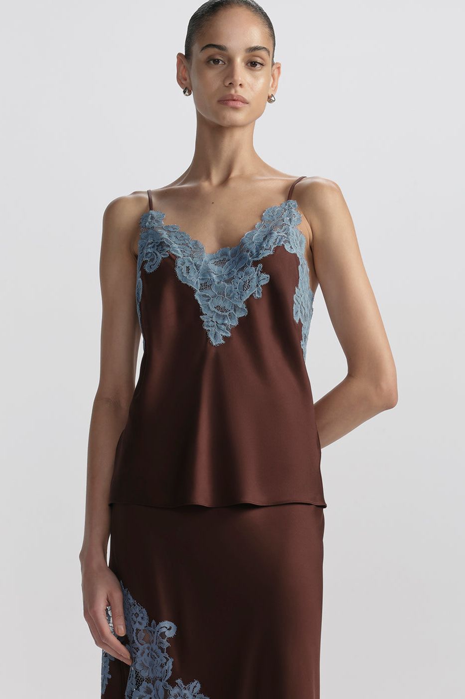
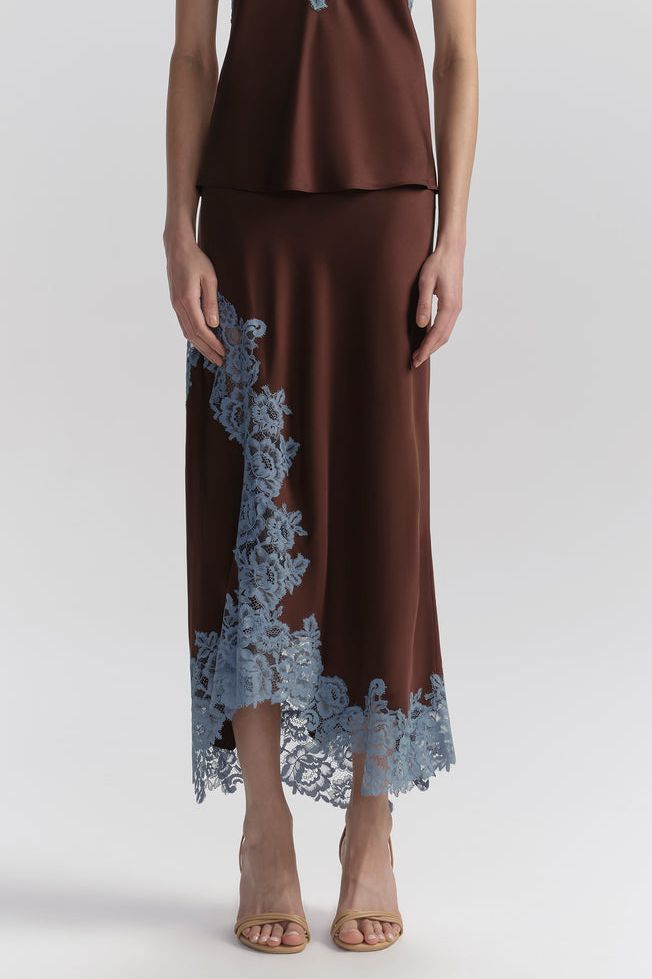
Chocolate brown and baby blue is a Y2K classic, and it’s officially back. I spotted the pairing in both Staud and Tory Burch’s latest collections. Here, I'm wearing it in this sumptuous satin set by ALC, complete with a Mansur Gavriel bag and Margaux heels.
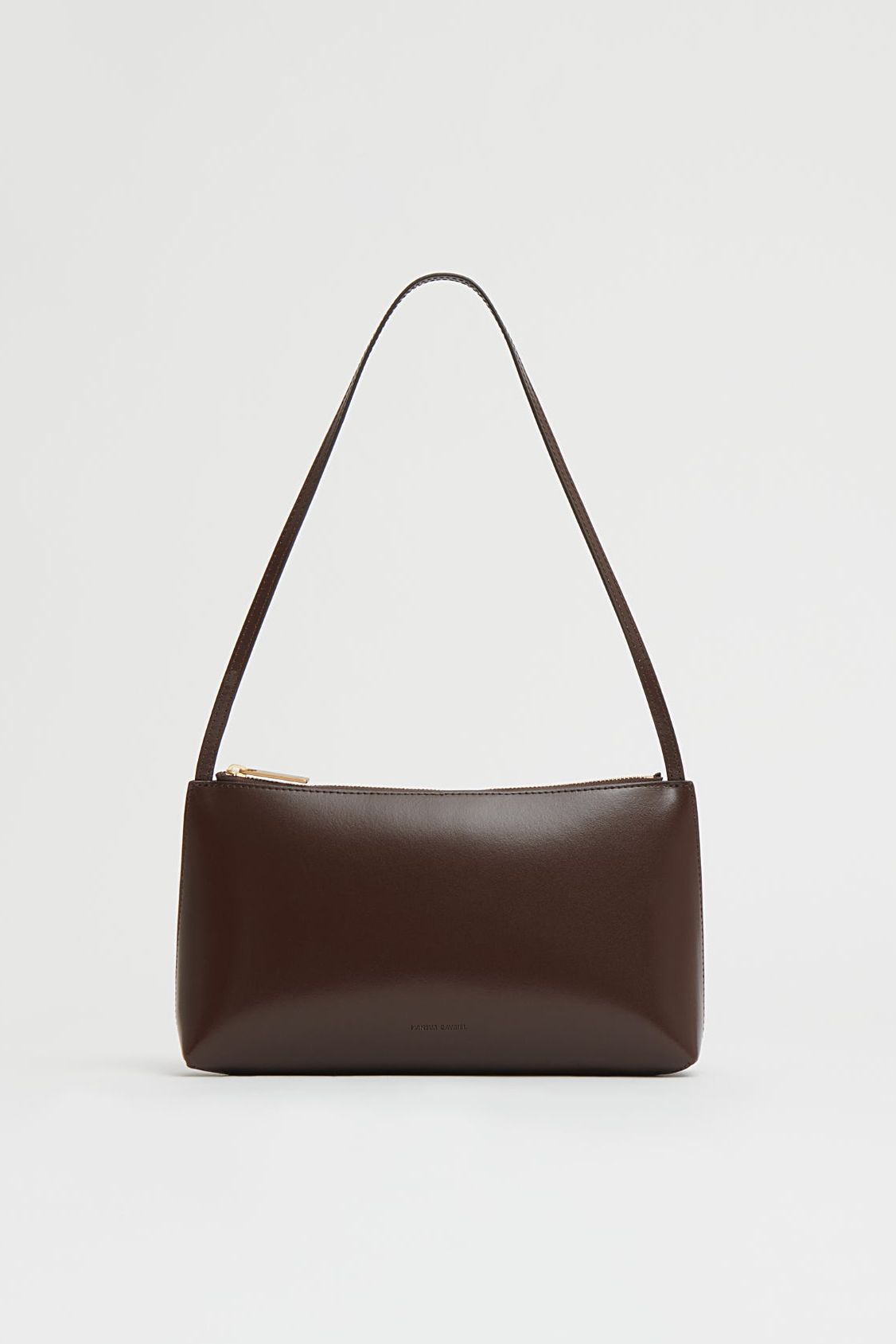
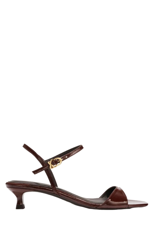
Bubblegum Pink & Merlot
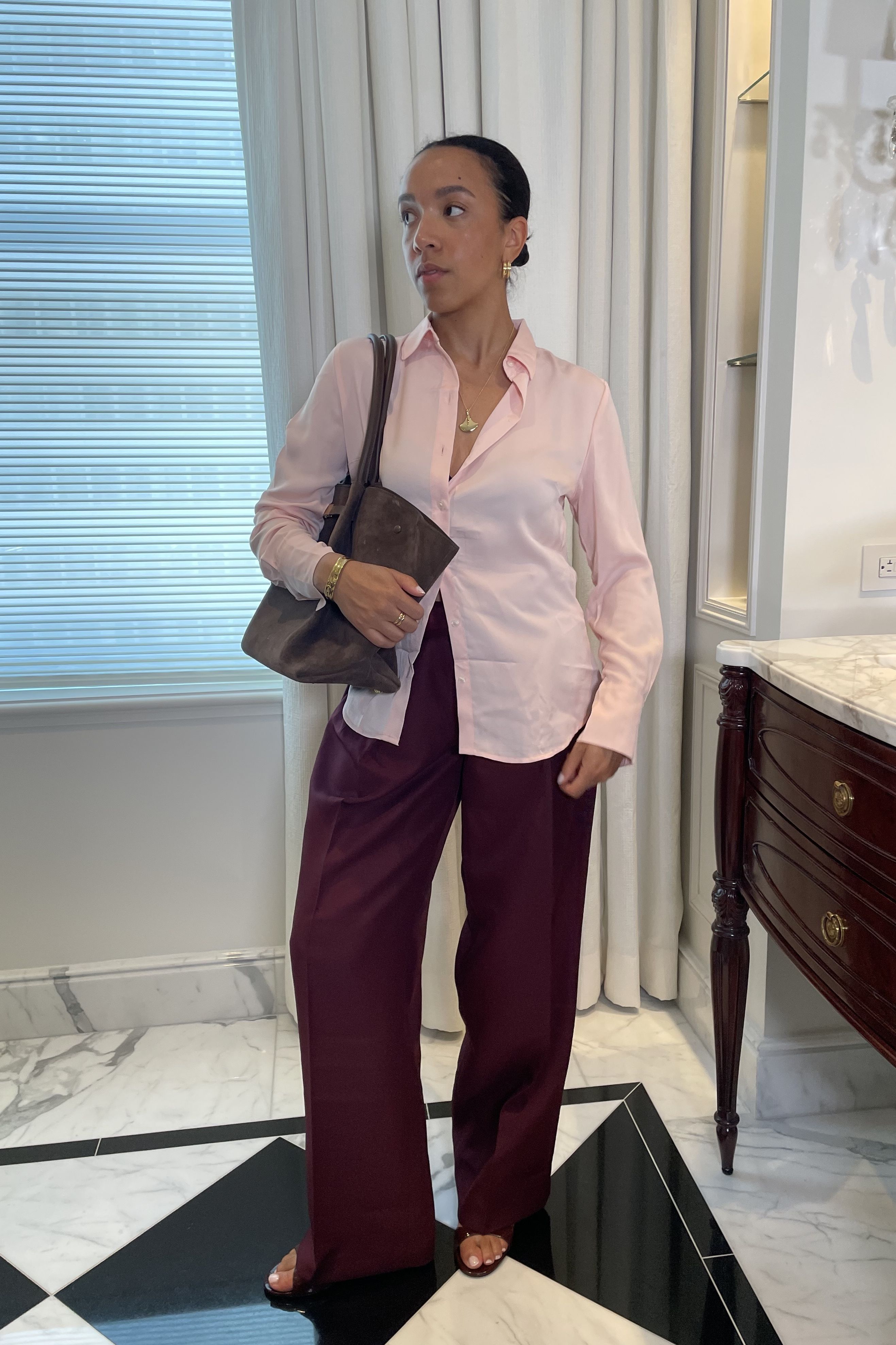
Bubblegum pink has been dominating fashion’s trend cycles for quite some time. However, Balenciaga and Chanel made the shade feel brand new by teaming it with rich merlot.
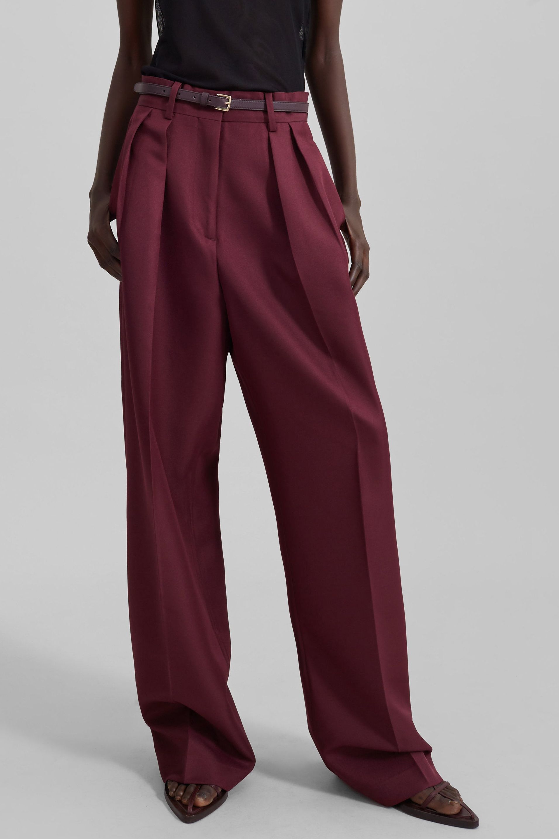
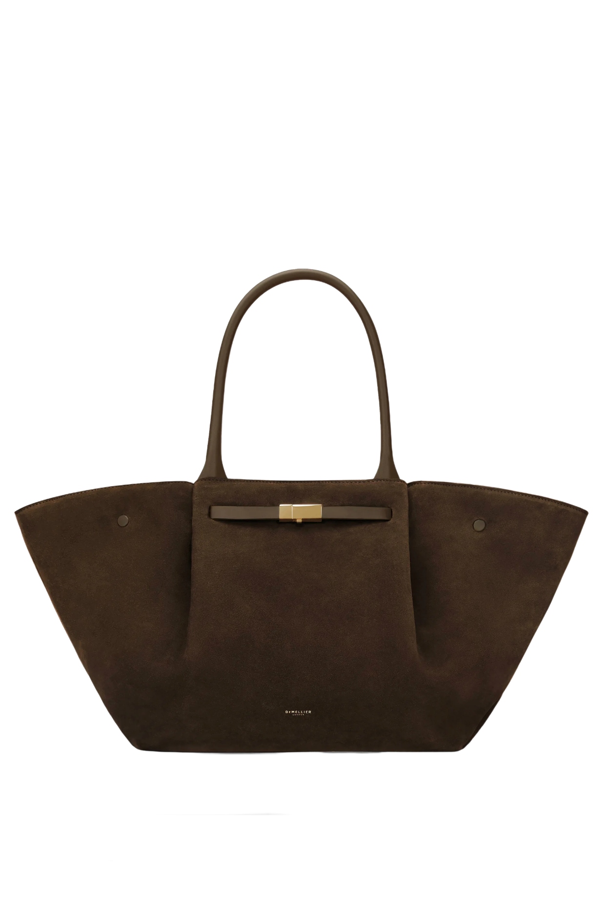
I put a corporate spin on the color combo by styling Frankie Shop trousers with a Banana Republic button-down. It's a sharp look that's perfect for long office days and post-work happy hours. I balanced out the saturated ensemble by adding neutral brown accessories, including Margaux heels and a DeMellier tote bag.
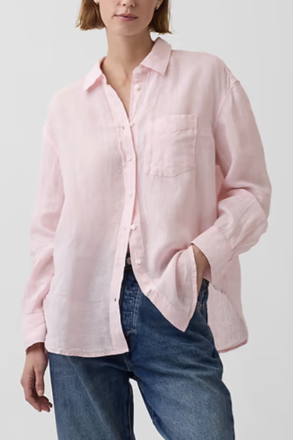
Butter Yellow & Sky Blue
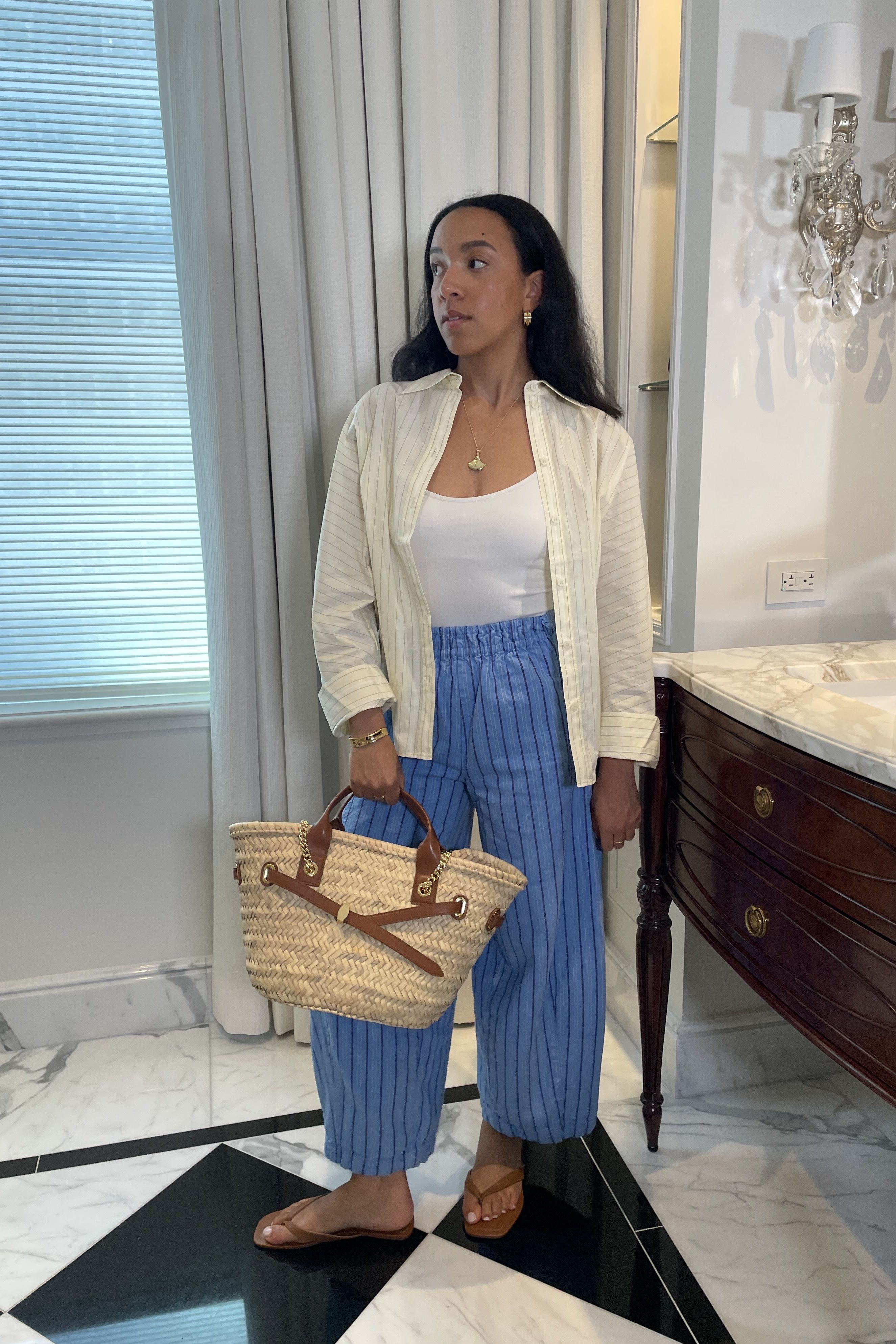
Butter yellow isn’t going anywhere this year—at least according to Chloé and Sandy Liang. These designers styled the delectable hue with sky blue for the Spring 2026 season. Of course, this combo works beyond the runways, too.
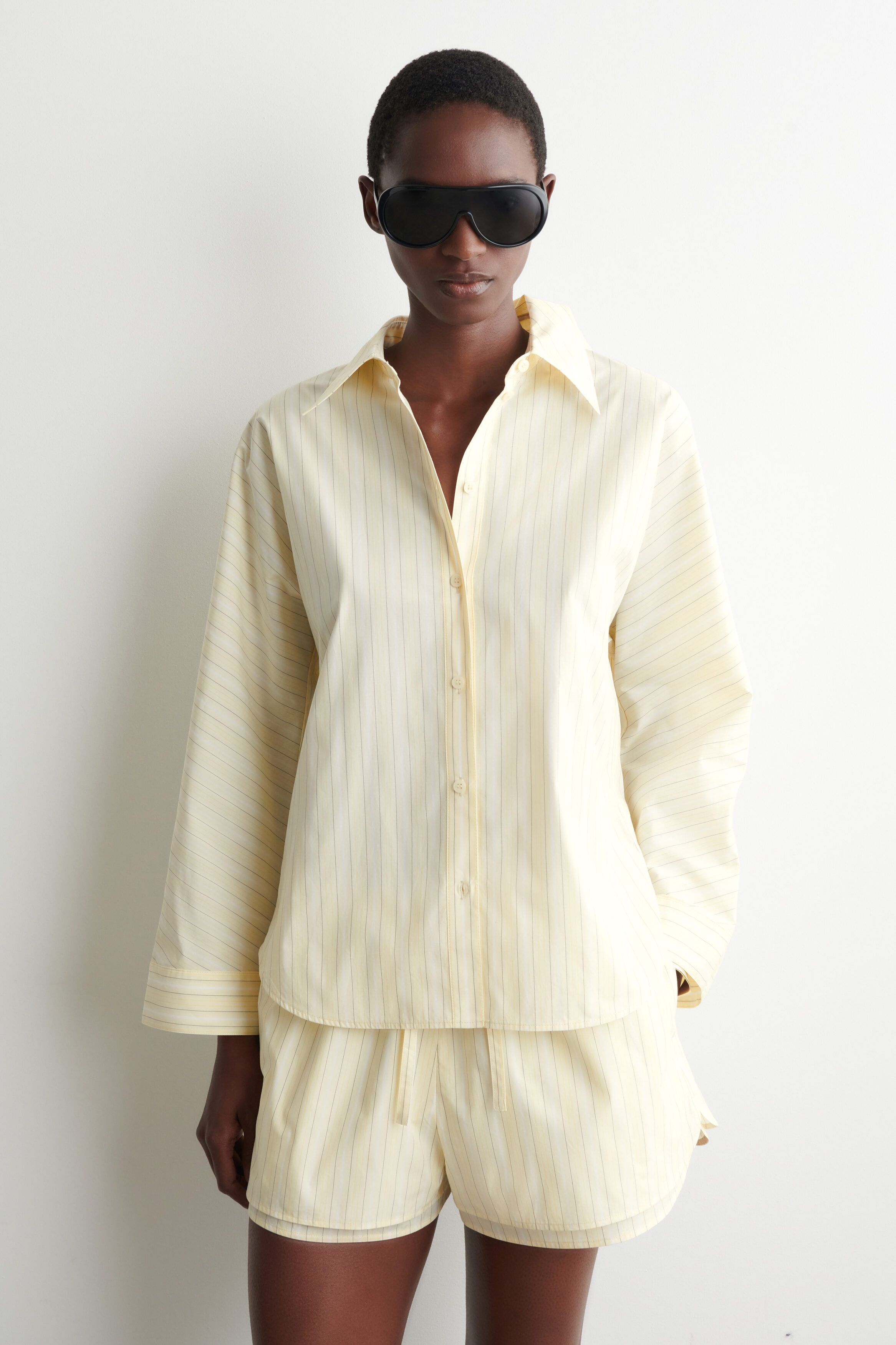
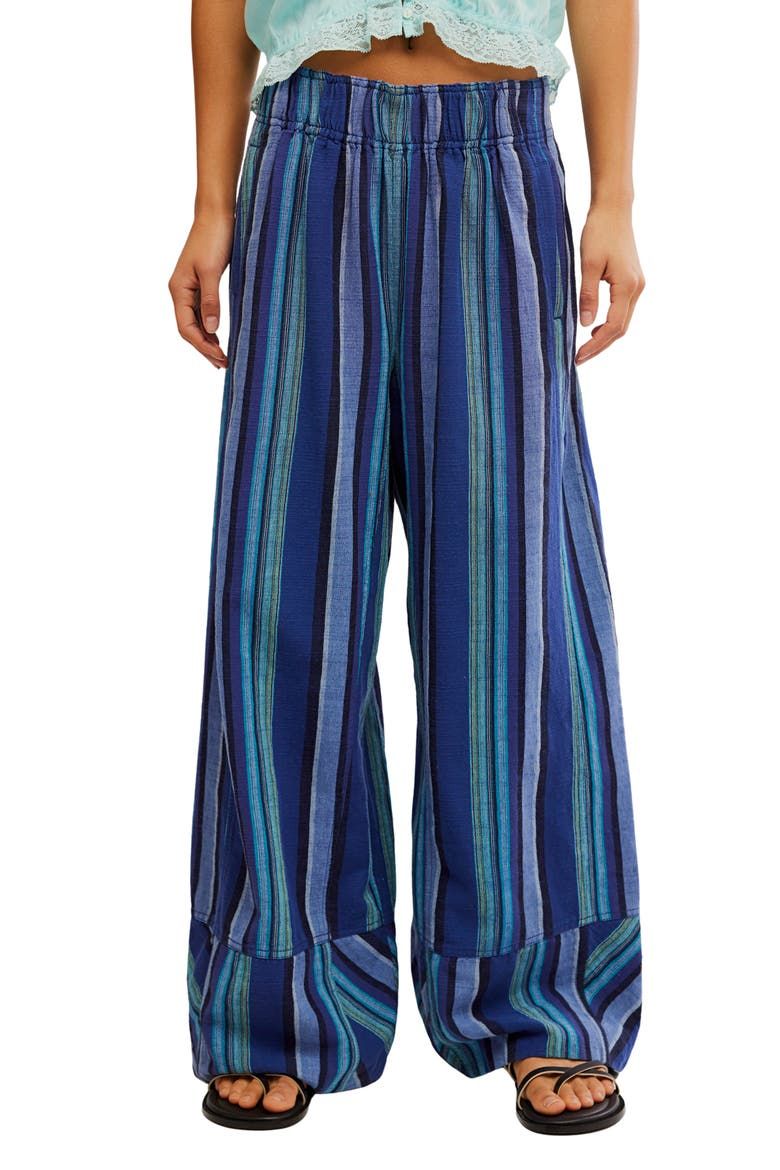
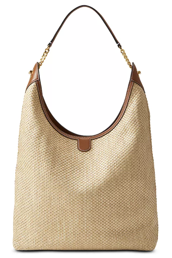
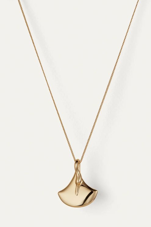
Pictured above, I styled it for a beach getaway with a breezy COS button-down, floaty Free People pants, and a Veronica Beard raffia tote. While the bottoms and bag are both sold out, I’ve found similar alternatives for you to shop below!
Read on the original site
Open the publisher's page for the full experience