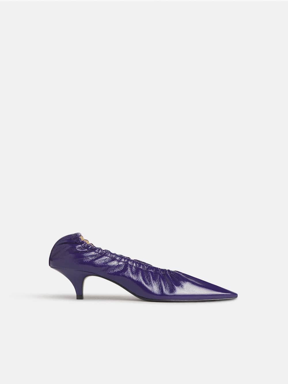
There is a quiet intelligence in knowing that the season's most powerful statement does not come from a coat or a bag, but from what you place on the ground beneath you. Autumn's rhythm asks for intentionality, and the six shoe shades we have seen emerge from the F/W 26 collections offer something far more nuanced than a simple trend report: they offer a vocabulary. This is not about chasing novelty for its own sake. It is about understanding that color, when chosen with care, becomes a form of self-communication. We have already watched how The print that lingers from autumn into winter's quiet refuses to be retired with the leaves, and how Orange knits steal the spotlight from winter's usual blacks proves that warmth can be worn. Footwear, however, is the foundation, literally and figuratively, and these six shades ask us to reconsider what we step into each morning.
What strikes us most is the restraint embedded in this palette. Royal purple, as seen at Ferragamo and Dior, does not scream for attention; it assumes it, drawing on a lineage of quiet opulence that feels entirely modern when rendered in a sculptural heel or a silk sandal. Chocolate pecan, that fusion of dark and light browns from Miu Miu and Burberry, signals a shift away from the severity of previous seasons toward something softer, more wearable, more human. And then there is extra foam, that frothy off-white that appeared across Victoria Beckham, Co, and Toteme, which challenges the assumption that autumn demands darkness. It asks a subtler question: what if lightness could feel just as grounded? These are not colors that compete with the foliage; they complement it. They allow the woman who wears them to move through the season with a sense of ease that is deeply intentional.
For the reader who finds herself drawn to the familiar, forest green offers an entry point that does not feel like a departure. Its presence at Hermès and Louis Vuitton repositions an earth tone as something quietly daring, especially when it appears on an over-the-knee boot or a ruched loafer. Apple red, meanwhile, is the shade that rewards attention to nuance: the difference between a bright Fuji and a moody Empire apple is the difference between a day in the orchard and an evening by the fire. Both belong. And more multitones, referencing Chanel's archives through Matthieu Blazy's lens, remind us that the most sophisticated color stories are rarely monochromatic. They layer. They reference. They refuse to be reduced to a single note.
The practical consequence here is not a shopping list but a shift in perspective. The woman who invests in one of these shades is not simply updating her wardrobe; she is signaling that she understands the difference between decoration and intention. The question to sit with is not which shade to buy, but which shade reflects the inner state you wish to carry through the season. That is the quiet luxury of it all.