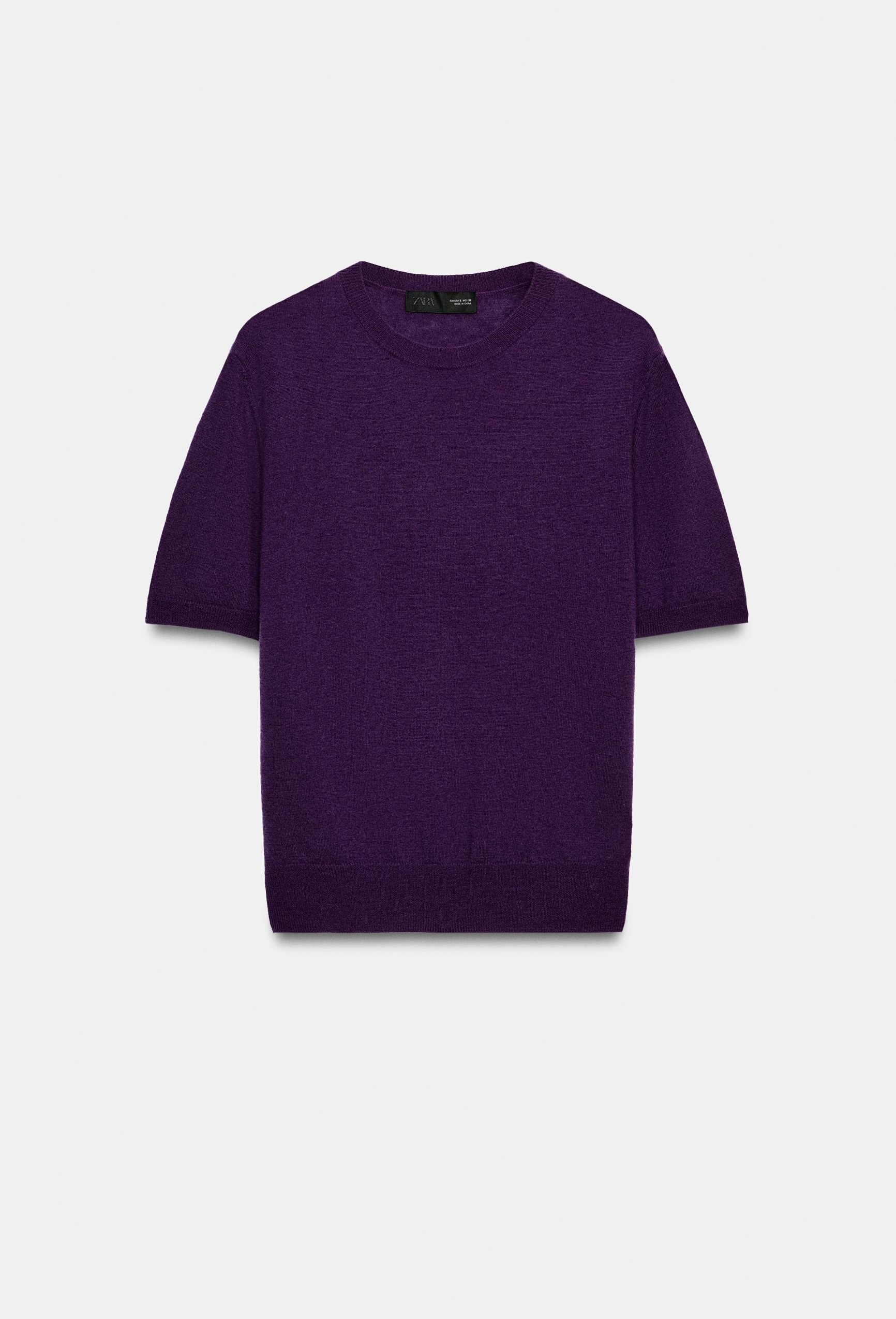
Color is returning to fall fashion, and the shift feels less like a rebellion and more like a quiet recalibration. For seasons, we've dressed in the safety of beige, charcoal, and olive, a wardrobe of restraint that signaled sophistication through absence. But the fall 2026 runways suggest something new: color as intention, not spectacle. Royal purple at Loewe, Yves Klein blue at Dries Van Noten, poppy red at Givenchy, and buttercream at Chanel all point to a palette that asks for confidence rather than volume. This isn't about chasing brightness for its own sake. It's about choosing a single saturated hue and letting it carry the entire silhouette, a practice that feels more aligned with self-knowledge than with trend-chasing. As we consider how to integrate this shift into our own closets, it's worth remembering that The Belts That Belong With the Outfit, Not Against It remind us that even the most restrained accessory choices can define a look; here, the same logic applies to color. A single shade, worn head to toe, becomes the structure of the outfit itself.
What makes this season's color story different from the brights of past years is its emotional weight. Royal purple isn't whimsical; it's dramatic and grounded. Yves Klein blue isn't playful; it's electric and graphic. Poppy red isn't festive; it's sophisticated and warm. These are colors with presence, not noise. They demand that the wearer be comfortable in them, and that comfort is precisely the point. The quiet luxury of previous seasons taught us to let fabric and cut speak for themselves. Now, color is being invited into that conversation on the same terms. It's not an interruption; it's an extension. And for those of us who have built our fall wardrobes around neutrals, the transition is less about overhaul and more about addition. One piece in a saturated tone, a trench, a top, a bag, can shift the energy of an entire outfit without disrupting its underlying calm. This is where the practical takeaway lives: you don't need to abandon your existing palette. You need one deliberate accent that feels like you.
The longevity of this shift is already signaled by the runways themselves. Yves Klein blue is emerging as a major color story for spring 2027, which means the shade we see now in coats and knits will carry into lighter layers and accessories. That kind of forward momentum matters. It tells us that this isn't a flash of seasonal novelty but a genuine evolution in how designers, and, by extension, we, think about color. The question becomes not whether to adopt the trend, but which hue resonates with your own sense of self. For some, that will be the quiet warmth of buttercream, a shade that feels both elegant and approachable. For others, it will be the unapologetic punch of poppy red, a color that announces presence without shouting. And for those who have always felt drawn to depth and mystery, royal purple offers a richness that feels almost narrative. As we navigate this season of chromatic revival, the real luxury is in the choice itself, not in covering every shade, but in committing to the one that feels most like home.