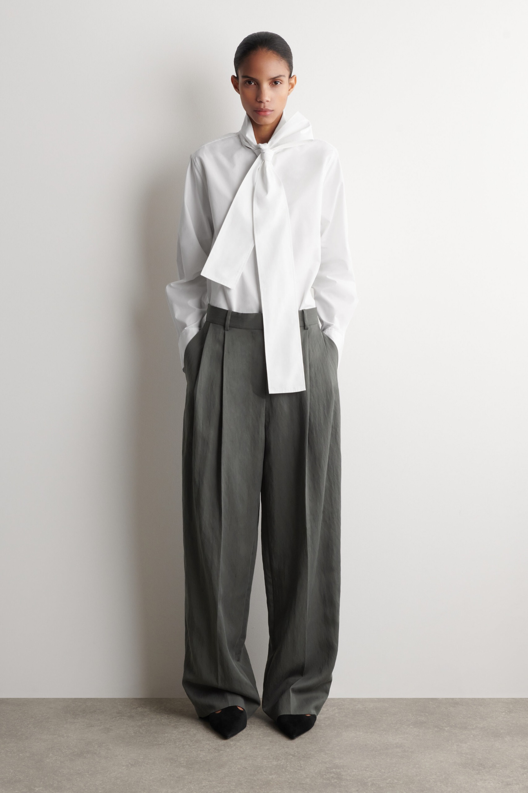
Colour, like confidence, is a quiet negotiation we have with ourselves each morning. Our editors have spent weeks debating which hues deserve a place in a winter wardrobe and which ones feel like they are merely passing through, and their conclusion is refreshingly honest: fashion is wholly subjective, and no shade is ever truly dated. Yet what emerges from their office debate is a clear editorial point of view: the colours that hold our attention this season are those that feel intentional, grounded, and quietly assured, not the ones that shout for it. This is not about rejecting vibrancy, but about choosing the right kind of it for the life you are actually living. For the minimalist, that might mean reaching for slate grey or espresso brown instead of teal or plum, while for the bolder dresser, royal purple or pumpkin orange offers a different kind of presence. The real takeaway here is that our individual colour instincts reveal something about how we want to move through the world, and that is worth paying attention to.
What strikes me most is how each editor's pause on a colour is not a dismissal of the shade itself, but a recognition of where they are in their own style journey. Brittany Davy steps away from teal not because it lacks beauty, but because slate grey feels more polished for the colder months, a grown-up neutrality that still carries weight. Maxine Eggenberger sets aside plum for espresso brown, admitting that if she is going to wear purple at all, it ought to be the vivid tones her colleague Remy Farrell champions, not the muted version. And Florrie Alexander, a self-described minimalist, trades cherry red for sea moss hues that slide effortlessly into the black, cream, and chocolate brown that already define her wardrobe. There is a quiet wisdom in these choices: they are not about following a trend, but about understanding which colours serve your actual life. As we explored in The Quiet Art of Wearing Red, the most compelling colour stories are often the ones that feel personal rather than prescribed.
The most fascinating tension in this discussion is the one between Remy Farrell and Ava Gilchrist, who sit on opposite sides of the orange-purple divide. Remy declares that royal purple commands attention, that it forces you to stand taller even if you have to fake the confidence at first. Ava, meanwhile, finds the pumpkin spice of orange a little too on the nose for autumn, preferring instead the piquancy of tangerine and clementine tones that feel less obvious. Neither is wrong; both are describing the same phenomenon from different angles. Colour is a tool for self-expression, and the question is not whether a shade is fashionable, but whether it feels like you. This is the same principle that guides Zoë Kravitz in her choice of ballet flat for winter, as we noted in Zoë Kravitz confirms the one ballet flat shade defining winter style, the most enduring style decisions are the ones that feel like an extension of who you already are.
The practical consequence for our readers is this: when you stand in front of your wardrobe this winter, do not ask yourself whether a colour is trending. Ask whether it makes you feel like the person you want to be. The editors who paused on red, burgundy, or black did so not because those colours are wrong, but because they no longer aligned with the woman each is becoming. That is the quiet confidence that matters, not the shade itself, but the self-awareness with which you choose it.